
Project background
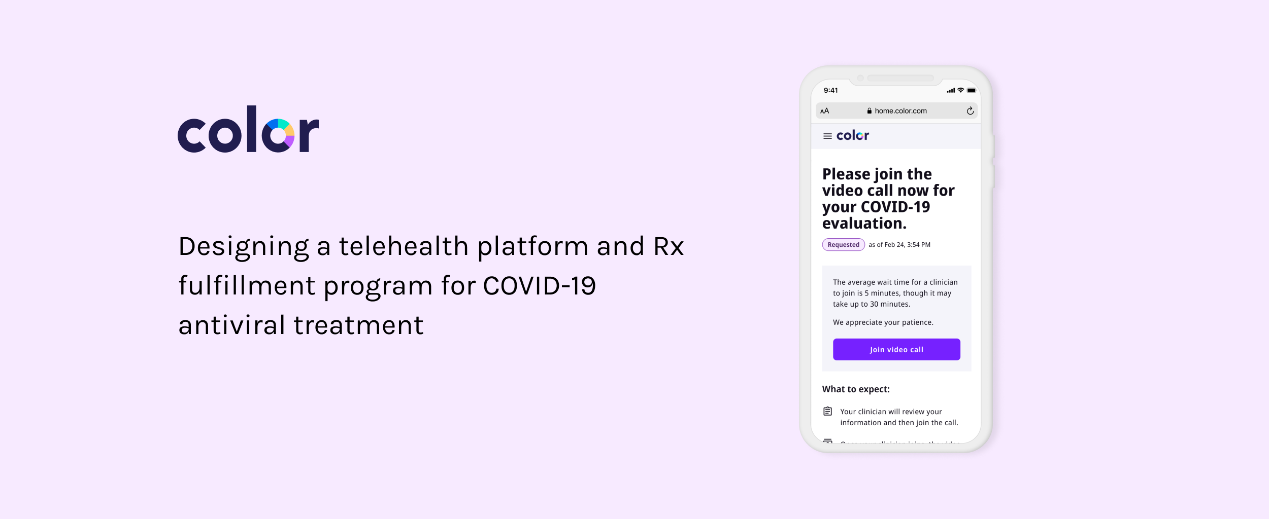
🦠 In early 2022 we saw a spike in Omicron. Paxlovid, an antiviral treatment for COVID-19, had just been granted emergency approval by the FDA. During this time, there was confusion about who was eligible for the treatment and where people could get it.
💊 In order to make it easier for high-risk populations to get access to this drug, we built Color’s first telehealth platform and Rx fulfillment program. This way, patients could access potentially life-saving treatment for free, without having to go to a doctor in person.
👀 Take a look at the application in production here.
I worked with an amazing team to get this product out the door quickly in response to the rising number of COVID cases.
We built an entirely new telehealth experience, integrated with a new clinical partner, and stood up a prescription fulfillment service in about 2 months.

The team:
Chief product innovation officer
Product manager
Content designer
Four engieneers
Product designer (me!)
We partnered with state public health departments to launch this service around the country

Massachusetts Department of Public Health
Washington State Department of Public Health
Oregon Department of Public Health
Wisconsin Department of Health Services
DC Department of Health
User journey
The end-to-end experience includes 3 high level steps:
An application flow, which includes collection of personal and health info
A video or phone consultation with a clinician
Prescription fulfillment

Focus on accessibility, equity, and ease of use
Because this was a public health program, we were especially concerned with meeting people where they are in terms of familiarity with tech, age, and language, just to name a few.
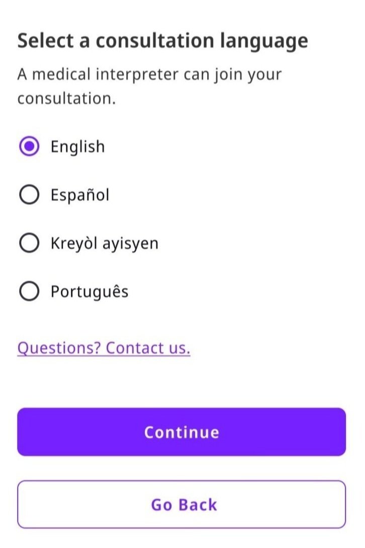
Designing for non-English speakers
For the initial launch, we needed to support 4 languages, based on county demographics. Today, the application has been translated in 17 languages.
We had to consider how things would render in different languages. For example, longer content on a button might wrap onto a second line when translated into a differnt language.
We also designed a process to support patients who would require an interpreter during their consultation with a clinician.
Designing for people who are less familiar with technology or have limited digital access
Medical equity is something that I became very invested in during my time at Color. As a part of the Medical Equity working group, I worked with a cross-functional team to investigate digital inequity and how it might impact the people engaging with our services and products.
Digital inequity can perpetuate existing social and economic inequalities, as those without access or skills may be further marginalized and excluded from the benefits of the digital age.
Examples of digital inequity include someone who has limited cellular data or no access to a smart phone, someone who isn’t familiar with using a computer or the internet to complete an application.
Some of the most vulnerable people are impacted by digital inequity such as elderly populations or people experiencing poverty.
Meet people where they are in terms of technology
To ensure access to as many people as possible, we built a telehealth platform that could accommodate phone or video consultations as well as a hotline for people without access to a computer.
Designing the hotline was a cross-functional project involving the support team who would go through the application flow on behalf of the patient and the product team.
We saw lots of engagement with the hotline and received positive feedback on the general usability of the service.
“I am a senior citizen who was able to schedule a telehealth consultation soon after testing positive. I had my prescription in hand within hours of our phone call. Pretty tough to beat that kind of service from our state government.”
-Washington Resident via The Seattle Times

Remove as many barriers as possible
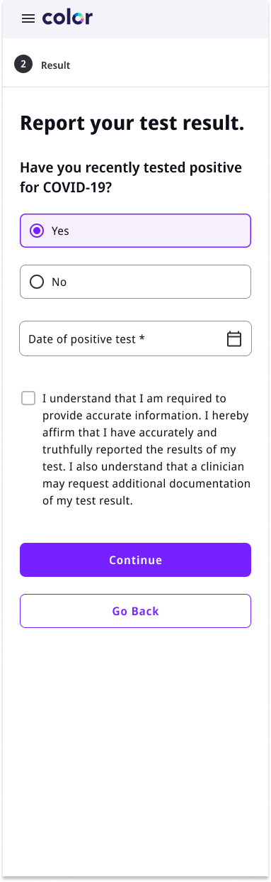
For the initial product launch, patients had to upload a copy of their positive COVID test. During the first week, we saw drop off at this step and our support team reported lots of calls from people who were having trouble getting past this step.
Based on the issue reports from the support team, we understood that people were having trouble uploading their result because it was a process they weren’t used to. This was happening a lot with senior populations.
We had some back and forth with the health department and our clinical partner, but were able to reach an agreement that would allow us to remove the upload requirement.

Original UX
Post-lauch improvement
Designing for people who are sick

In the spirit of accessibility and keeping in mind that our users would have tested positive for COVID, we wanted to create a flexible UX.
For patients who might be isolating at home alone, we designed a shipping option for treatment.
We were also mindful of the fact that some people could be experiencing severe symptoms and want to pick the prescription up from a nearby pharmacy as soon as possible.
Make it scalable
I worked closely with designers from other product verticals to make sure the UX we built for this program would fit in to the broader patient lifecycle with Color and that components would be reusable for other teams.
I had pair design sessions to go over different scenarios and stress test potential issues that could come up during implementation for other telehealth services.

Impact of this work
📍 Active programs in MA, WI, OR, WA
📞 18,451 phone consults
💻 32,609 video consults
☎️ 1,081 hotline consults
💊 30,826 prescriptions issued
🌐 17 languages supported
*As of Feb 2023