
Overview
The Museum of Contemporary art is one of Chicago's key cultural institutions and a center for community and innovation. For my second class project I was tasked with redesigning the museum's online store to improve user experience while keeping business interests in mind and reflect the MCA's mission and values.

Role: Researcher, Information Architect, UX Designer, Visual Designer
Deliverable: Medium-fidelity wireframe prototype, high-fidelity mockup
Time Frame: 2 weeks
Identifying the Problem Through Research
Like all good user-centered design, my process began with user research, which I conducted at the MCA's physical store. I spoke with shoppers and store employees to get a sense of the store demographics, popular items, shopping patterns, and the museum's mission & values.

Store Observations
I noticed shoppers spent a great deal of time browsing and seemed to enjoy the tactile experience of choosing items to purchase.
Each person I spoke with pointed to the store's unique merchandise as their reason for shopping there.
User Interviews
While I was in the store I asked several employees what they perceived the museum's mission to be and this was my favorite response:
“local for the community, an international voice for artists, audience activated, innovative, and to support new, emerging, and established artists.”
User Groups
1. Tourists visiting the museum who hope to find a souvenir, gift, or "knick knacks"
2. People who stumble upon the store via the street entrance
3. Returning shoppers (locals or members) who visit the museum with the sole intent of shopping
User Feedback on the MCA Website
In addition to my in-store research, I had users go through the museum's current store site and talk me through their experiences and through this process, I uncovered several problems with the website. Here's a look at the MCA store's current site:

Users highlighted the disorienting visual design, particularly the background grid.
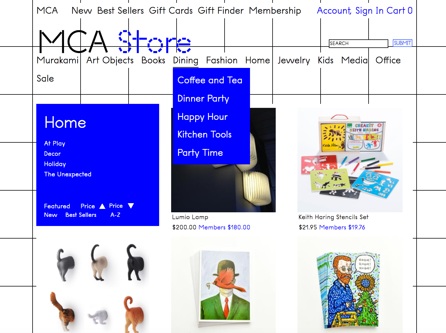
Users were confused by the creative navigation categories and two navigation menus fighting for attention.
Identifying Opportunities
After analyzing my research findings, I noticed several areas of opportunities for the museum.
There are opportunities for more membership promotion in the online store, to use the web store to get shoppers interested in artists, to create a more symbiotic relationship between the web store and the museum, and to achieve something similar to the pleasant in-store browsing experience.
These opportunities, coupled with problems that I identified with the store's current site helped inform the ideation process for devising a solution.

Solutions should:
Create a clear and enjoyable browsing experience and reflect the museum's commitment to innovation and providing a platform for artists.
Highlight the store's unique inventory, promote membership, and connect people with the museum.
Design Solutions
I started my design process by tackling the problem of the confusing navigation categories with some card sorting and then built a site map.
I created medium-fidelity wireframes with the intent to keep the design clean and uncluttered. After conducting several rounds of user testing and changing things based user feedback, I upped the fidelity of the prototype, focusing on creating image-rich pages to highlight the store's unique merchandise.
I added multiple product views and a product video feature in an attempt to mic the pleasurable in-store browsing experience that surfaced during my research.
I built the Curated by the Artists feature to build user interest in the museum and the artists that it supports. Curated by the Artists features new and established artists with a short bio and photo and gives users the option to learn more or shop a list of curated store products picked by the artists.
I decided to feature the special exhibit shop more prominently in the primary navigation and below the fold of the store's landing page. To get shoppers interested in visiting the museum, I added an exhibit photo and short write-up to the top of the special exhibits shop.
Museum's rely heavily on membership sales so to satisfy business requirements, I decided to add passive and overt membership reminders, including a banner that appears on all store pages and a membership pop-up that appears prior to check out. Non-members are given the option to purchase a membership with their other store items and receive the member discount.
Lastly, I designed a more streamlined and transparent check out process and made purchasing easier for members by auto-populating their personal and payment information.
Next Steps

If I had more time I would...
+ Push the museum-online store relationship a bit further and create more robust informational pages about the artists.
+ Continue to explore ways of mimicking the experience of in-store browsing, which is an interesting topic as e-commerce continues to compete with brick & mortar.